Have you ever wanted to use two different styles of drop-down menu in a Flare topic? Well the good news is that it is possible, and I’m going to show you how to do it. Unfortunately, it isn’t immediately obvious in Flare and you are going to have to poke around in the CSS a bit.You’ll also find this useful if you want to change the colour of the text and links in the drop down hot spot and also the drop down text.

One Topic, Multiple Drop-Down Styles
The best way to do this is to guide you through an example. We’ll take a quick look at some of the CSS properties, but I’m not going to go into them in great detail – if you don’t know what they do, look them up online. I don’t know what some of them do, so I can’t pretend to be an expert!
To begin, let’s create a drop down list in a Flare topic by selecting Insert >Drop-Down Text.For this example, I’m going to set the text for the drop-down hotspot to be something amazingly creative – Drop Down List 1. Yep, hold on to your hat, because that’s the sort of crazy s**t that is going down today. You can do the same, or you can use some other text, it is up to you.
Next, let’s add a short bullet list as the text in the drop-down. Point 1, Point 2, Point 3, and Point 4 should do it.
Do that again, so that there are two drop-down lists on the page.
Okay, now open the the Text Editor and take a look at the code for what you have just created. You will see that the drop-down consists of a hierarchy of elements:MadCap: dropDownMadCapdropDownHeadMadCapdropDownHotSpotMadCapdropDownBodyThese all take their styles from the .CSS stylesheet for your project. So let’s go take a look at them in there.
Open your .css file (Resources>Stylesheets) in the internal text editor. (I’ll assume you have the default styles.css in place).
Do a search for dropdown (Ctrl +f to search).
Let’s look at each dropdown style in turn, starting with dropDown.MadCap|dropDownmargin-bottom: 6px;margin-top: 6px;mc-closed-image: url('../Images/DropDownClosed.png');mc-disabled: false;mc-open-image: url('../Images/DropDownOpen.png');}So what we have here is the styling for the space above and below the entire drop-down, the images for when the list is open and closed, and also the mc-disabled property, which to be honest, I haven’t the foggiest about. It always seems to be set to false, so that’s how I leave it. At this stage, don’t change anything anyway, as you may want to create a new style – I’ll discuss that later on.Next up is:MadCap|dropDown.Footer{mc-closed-image: url(‘../Images/DropDownSmallClosed.png’);mc-open-image: url(‘../Images/DropDownSmallOpen.png’);}These define the location of the images that are used for opening and closing the drop-down list in the footer (the green and white arrows).
Note what MadCap have done here – they have created a new drop-down class called Footer, which uses different styles. You are going to do exactly the same thing.Next, we have:MadCap|dropDown.SecondLevel{margin-left: 10px;mc-closed-image: url('../Images/DropDownClosedSecondLevel.png');mc-open-image: url('../Images/DropDownOpenSecondLevel.png');}These are just defining the images and indent used for second level drop-downs.Next up is dropDownBody:MadCap|dropDownBody{border-bottom: solid 1px #bed230;mc-disabled: false;}This sets the colour and thickness of the line (green) that is shown at the bottom of the drop-down.Next:MadCap|dropDownBody.FooterTopicMaster{border-bottom-color: #b3b3b3;}Sets the colour for a class called FooterTopicMaster. I’m not sure where this is and I have never changed this setting. The same can be said of the next one.MadCap|dropDownBody.Final{border-bottom: 0px;}and the next one:MadCap|dropDownHead{mc-disabled: false;}So let’s carry on with:MadCap|dropDownHotspot{color: #404040;font-size: 0.9em;font-weight: bold;mc-disabled: false;}These values set the colour and style of the text for the drop-down hotspot in the main topic area of your content.On to:MadCap|dropDownHotspot:hover{color: #BED230;font-weight: bold;}This defines the colour and style of the drop-down hotspot text when you hover the cursor over it.Next:MadCap|dropDownHotspot.Footer{color: #ffffff;font-size: 0.8em;}These values define the style of the drop-down hotspot text in the footer.And last but not least:MadCap|dropDownHotspot.Footer:hover{color: #BED230;}This defines the appearance of the drop-down text in the footer, when the cursor is hovered over it.
Okay, so now you know what styles are in place for the drop-down menus by default. Now you can start to make your own styles.If you make changes to the drop-down styles that are already in the stylesheet, they will apply by default when you select Insert>Drop-Down Text in Flare. So you can set up your most-commonly used drop-down style that way if you want.Personally, I prefer to leave the default Flare settings alone and create my own – that way, if MadCap change the settings for their defaults in later releases, the changes won’t affect my projects.To make your own custom styles, just copy the existing Flare dropdown styles in the stylesheet, paste them back in further down, then edit and rename them.I usually enter a comment in the style sheet before I paste the copied styles in place as a) it keeps the copies and the originals separate and b) you can add a comment to let other people know what you have done. So something like:/* added new drop-down styles*/When you have added the copies into the style sheet, you need to give them a new class name. This bit is easy – you just use dot notation to add the class name to the end of the style.To add a new class to the MadCap|dropDownBody, you just enter :MadCap|dropDownBody.newclassnameFor example:MadCap|dropDownBody.RedDropListFor the more complex styles it is the same principle, for example:MadCap|dropDownHotspot.RedDropList:hoverRemember that the drop-down styles with .Footer in them are already custom classes (called ‘Footer’), so you can simply replace the ‘Footer’ part with your custom class name:MadCap|dropDownHotspot.RedDropList:hover
Change the values for each of your new drop-down classes, for example, you can change the colour of the text. They won’t be applied to your drop-down lists just yet, but that bit is coming up later. Hold your horses!For this example, create two sets of custom classes, one called RedDropList that uses red as the text colour and one called GreenDropList that uses, wait for it…green.MadCap|dropDown.RedDropList{margin-bottom: 6px;margin-top: 6px;mc-closed-image: url('../Images/DropDownClosed.png');mc-disabled: false;mc-open-image: url('../Images/DropDownOpen.png');}MadCap|dropDownBody.RedDropList{border-bottom: solid 1px #bed230;mc-disabled: false;border-bottom-color: #ff0000;color: #ff0000;}MadCap|dropDownHotspot.RedDropList{color: #E50000;font-size: 0.9em;font-weight: bold;mc-disabled: false;}MadCap|dropDownHotspot.RedDropList:hover{color: #2D8DCC;font-weight: bold;}MadCap|dropDown.GreenDropList{margin-bottom: 6px;margin-top: 6px;mc-closed-image: url(‘../Images/DropDownClosed.png’);mc-disabled: false;mc-open-image: url(‘../Images/DropDownOpen.png’);}MadCap|dropDown.GreenFooter{mc-closed-image: url(‘../Images/DropDownSmallClosed.png’);mc-open-image: url(‘../Images/DropDownSmallOpen.png’);}MadCap|dropDownBody.GreenDropList{border-bottom: solid 1px #007300;mc-disabled: false;color: #008000;}MadCap|dropDownHotspot.GreenDropList{font-size: 0.9em;font-weight: bold;mc-disabled: false;color: #008000;}MadCap|dropDownHotspot.GreenDropList:hover{font-weight: bold;color: #00fa9a;}
Now, there’s one last thing you might want to do in the stylesheet and that is to create a custom class for links in the drop-down menus. That’s so that we can use different colour hyperlinks in the drop-downs if we wish. If you don’t create new link classes, the drop-down content will use the same colour links as everywhere else in your project. That’s often perfectly fine, but if you want to use a drop-down footer like the one in Flare’s default projects, you will need a different link colour. Madcap have used white, because their footer has a dark background.To create a custom a class, just copy the a:link, a:visited, and a:hover classes in the stylesheet, paste the copy in, and then rename the copy styles using the same dot notation as before, and edit those.So something like:a.white:link{color: #ffffff;font-weight: bold;}a.white:visited{color: #cccccc;}a.white:focus{color: #ffffff;}a.white:hover{color: #BFBFBF;}a.white:active{color: #ffffff;}
Save the style sheet.
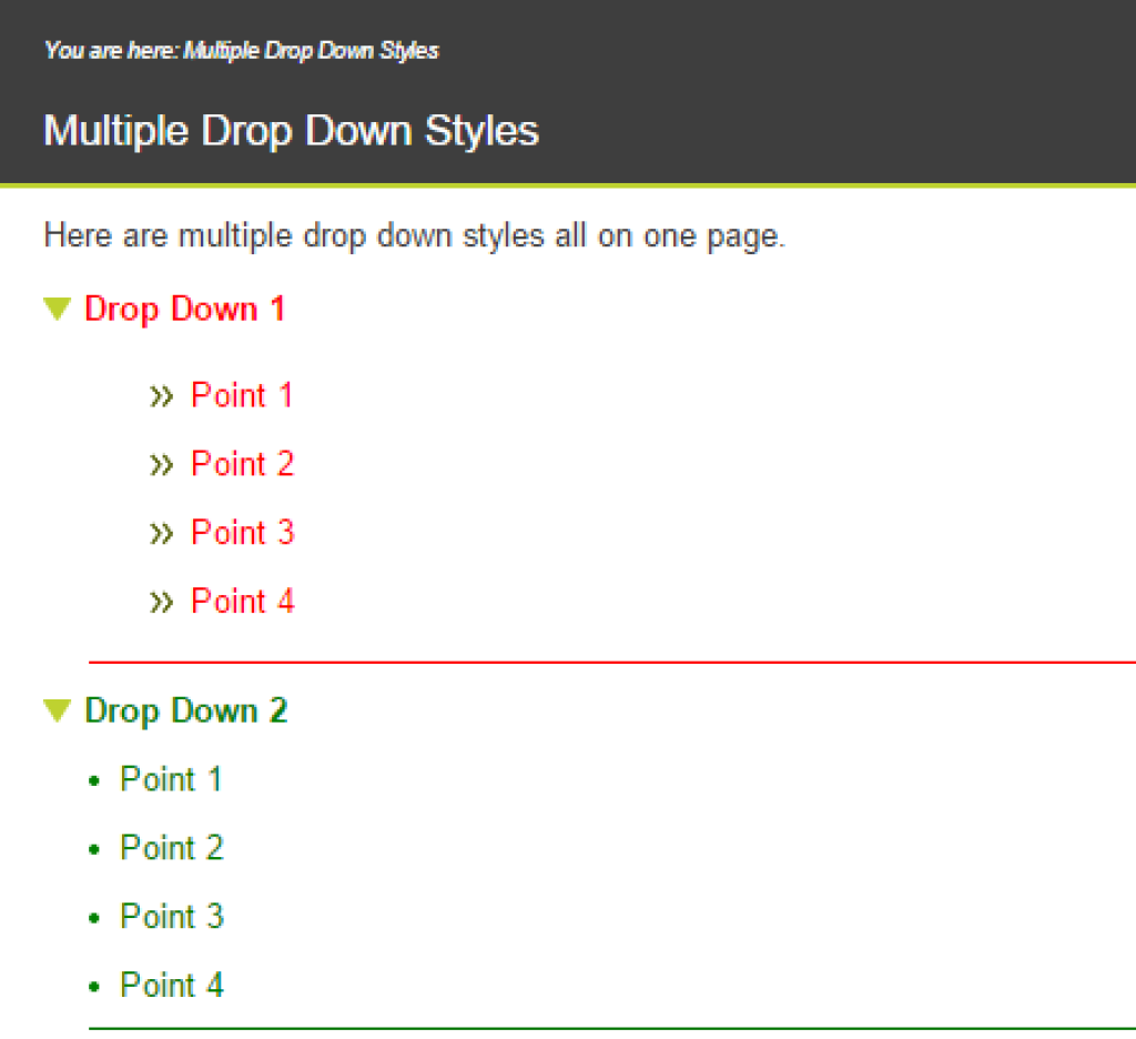
Now you need to apply the styles to your drop-down lists – open your topic in the text editor and look at the drop-down elements of the page.Add class=”RedDropList” to the MadCap:dropDownHead, MadCap:dropDownHead, and MadCap:dropDownBody elements in one of your drop-down lists. This applies the drop-down RedDropList class settings to the drop-down menu.Repeat this for the next drop-down list, only add the GreenDropList class instead. If you want to have hyperlinks of a specific colour in your drop-down text, add the a class name to the a refs.<h1>Multiple Drop Down Styles</h1><p>Here are multiple drop down styles all on one page.</p><MadCap:dropDown class="RedDropList"><MadCap:dropDownHead class="RedDropList">Drop Down 1</MadCap:dropDownHead><MadCap:dropDownBody class="RedDropList"><ul><li><a class="white">Point 1</a></li><li><a class="white">Point 2</a></li><li><a class="white">Point 3</a></li><li><a class="white">Point 4</a></li></ul></MadCap:dropDownBody></MadCap:dropDown><p></p><MadCap:dropDown class="GreenDropList"><MadCap:dropDownHead class="GreenDropList">Drop Down 2</MadCap:dropDownHead><MadCap:dropDownBody class="GreenDropList"><li><a class="white">Point 1</a></li><li><a class="white">Point 2</a></li><li><a class="white">Point 3</a></li><li><a class="white">Point 4</a></li></MadCap:dropDownBody></MadCap:dropDown>
When you build the help, you will see that your drop-down lists use different styles (the two custom styles you have created).